Recent posts

Alarming
How Retail Theft Affects Florida-Based Businesses
01 May 2026

Fur, Fins & Feathers
How To Choose The Ideal Dog Food
28 April 2026

Fur, Fins & Feathers
Mindful Dog Nutrition: Why Quality PET Food Matters
27 April 2026

nichemarket Advice
What Is A Cold Calling Agency?
23 April 2026
Popular posts
Extravaganza
Trending Music Hashtags To Get Your Posts Noticed
24 August 2018
Geek Chic
How To Fix iPhone/iPad Only Charging In Certain Positions
05 July 2020
Extravaganza
Trending Wedding Hashtags To Get Your Posts Noticed
18 September 2018
Money Talks
How To Find Coupons & Vouchers Online In South Africa
28 March 2019
How to craft the perfect blog post
26 April 2017 | 0 comments | Posted by Shamima Ahmed in nichemarket Advice
Time and time again we have to help clients with optimising blog posts. A lot of the time companies do not see the importance of the blog pieces and are just seen as nice to have. In the world of SEO we hear time and time again that content is king, but what the don't tell is that layout is queen as is the beauty that captivates the readers and keeps them staying a little bit longer.
Key elements to consider when writing a blog post
Even though layout needs to be considered when writing the piece, a great layout does not make up for mediocre content. It may keep readers attention for longer but nothing can replace poorly written content. The layout is merely the aesthetics that adds that little something to your piece. If you struggling with coming up with great ideas for content pieces, try using one of these nifty blog topic generators It's always good to ask yourself the following questions when reviewing your post.
- Is my post easy for users to digest? (i.e. it's not just one big paragraph or text upon text with no style variations)
- Does it promote scanability and easy for users to pick up the essence of the piece without having to read anything?
- Is the language I am using tailored to my audience?
- Am
i adding value with this post?
If your answer is no to any of the above, here's how to fix it!
The optimal layout for a blog post
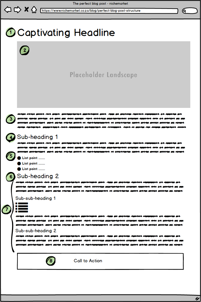
For the sake of simplicity, we will use the following model as a reference to

- Create a Killer Headline
- Hot Placeholder Image
- Intro containing key insights
- Set the tone with a Subheading
- Body Content layout
- Subheading: Continue your article flow
- The How to Section
- Convert those readers
This is the first point of contact readers will have with your piece. It makes or break on whether they will continue reading. You have two task here:
1. Include your Key focus and
2. Make sure it grabs the readers attention
More on creating killer headlines here.
Choose a related but hot placeholder image that is alluring and will attract users. This will most likely be the first visual element they will see both on your landing page and on all social platforms.
The point of your intro text is to get users to read your opening. If they read the entire intro, they will most likely read the entire article. You have 3 to 4 sentences to work with here, make it count!
This subheading has one purpose and one purpose only, i.e. to get used to reading the first piece of content. Set the Tone by asking a question or introducing the focus topic. Keep it relevant and captivating.
Your first piece of body content should try and trigger some sort of emotion in a user, help them relate and make them connect with the piece. If you set off this trigger they are more likely
Set the tone for the next content piece by bringing out its key focus. This is the part of the article where people learn something or discover what they needed to, this is the whole point of why the article came about.
This portion is the bulk of your body content. The essence of your article will be presented here and this is where readers will learn and discover step by step process or the answer to the question you posed in your heading. Break this section into subheadings if it's easier to read, or use bullets and list where appropriate.
This may be the end of the blog post, but it might just be the start of your relationship with your customer. You captivated them, you gave them some knowledge, now you asking for a little something-something in return. You have two lines to sum things up and hit those readers with a call to action. If you really want them to take action, add a link or two so they have something concrete to follow up on.
And that's what it takes to write a killer blog post and laid out to perfection. If your posts aren't doing what they should try improving the layout and see how they perform. If you looking for a real live sample, you reading it. Have a look at our other blog posts for more examples.
Contact us
If you have any questions or would like to know more about optimising blog posts, comment below or feel free to contact us here!
You may also find these useful:
Tags: blogging, Content Marketing, How to, SEO, User Experience, users first
You might also like
What Is Search Everywhere?
06 April 2026
Posted by Che Kohler in nichemarket Advice
How SEO managers will have to adapt to users finding content via social media, LLMs and forums and why strategies will need to adapt to tap into thos...
Read moreHow Retail Theft Affects Florida-Based Businesses
01 May 2026
Posted by Che Kohler in Alarming
A look into how much retail theft costs stores across Florida, what the down stream impacts are and what you can do to reduce your risk as a shop own...
Read more{{comment.sUserName}}
{{comment.iDayLastEdit}} day ago
{{comment.iDayLastEdit}} days ago
 {{blogcategory.sCategoryName}}

